The Role of Typography in Shaping a Brand Perception
June 12, 2023
Written by Marija Jamandilovski
7 min read
Crafting a strong brand identity is essential for any organization. It helps you stand out from competitors, make a memorable impression on your audience, build meaningful connections, and form the foundation of how your company looks and feels. But here’s one seemingly small thing that plays a significant role in shaping that brand identity – typography.
If you think about it, every time you see a logo, visit a website or read a social media post, typography is there, silently communicating with you. The fonts, the sizes, the spacing—every little detail contributes to the overall perception of a brand. Typography has the power to evoke emotions, convey messages, and create visual appeal. It’s like the unsung hero of brand identity.
So, let’s explore why it is so important. We’ll uncover its influence on visual recognition, how it conveys your brand’s personality and values, and the emotional connections it can create with your audience.
How Typography Affects Perceptions
Typography is no ordinary accomplice to language—it’s a transformative force that can breathe life into words, redefine their essence, and influence our perceptions. The choice of typeface holds the power to evoke emotions, set the ambiance, and shape the very fabric of communication. It’s a fascinating reminder that typography is not just a visual element but a storyteller in its own right.
So what can we do with the right choice of typeface?
Which party would you rather go to? What kind of fun do these two different typefaces promise to deliver?

Who would you hire? Which of the Annes promises to keep your baby safe?
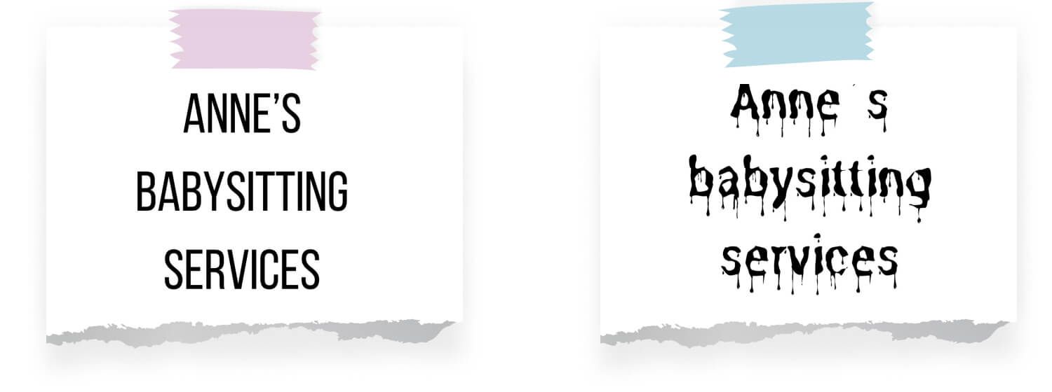
Who do you trust more?

As you can see, a simple change in typography can breathe new life into words and alter their meaning. But things can easily go wrong if you don’t pay attention.
Infamous Typography Fails
Let’s dive into the dark side of typography and explore how a bad choice can wreak havoc on your identity. Trust us, the consequences can be dire.
Finding God in Comic Sans
Have you heard the infamous tale of the team that discovered the “God Particle” and their choice of typography: Comic Sans? In a truly unexpected turn of events, the team’s monumental scientific discovery was overshadowed by a font that is associated with casual, playful contexts rather than groundbreaking scientific breakthroughs. The use of Comic Sans in their announcement raised eyebrows, eliciting mixed reactions from the scientific community and the general public.

While some found it endearing and relatable, others criticized it as a lack of professionalism or a trivialization of their accomplishment. The incident serves as a reminder that typography holds immense power in shaping perceptions.
Papyrus in Space
Ah, the enigmatic case of the Avatar movie logo and its unexpected choice of typography: Papyrus. Papyrus is considered an overused and poorly designed font that does not convey the level of sophistication and uniqueness expected for a high-budget blockbuster film.
While the movie itself was a visual masterpiece, the typography choice left some perplexed. It sparked discussions and debates, with some criticizing it as a lack of originality or attention to detail.

It drew attention away from the movie itself and became a source of ridicule and memes, even becoming a hilarious SNL skit.
Consequences of poor typography choices

-
Lack of Visual Appeal – Picture this: you come across a brand with a font that looks like it belongs in the ’90s. Instantly, it gives off an outdated and unprofessional vibe. A bad choice of typography can make your brand appear dull, uninteresting, and unappealing. And let’s face it, if your typography fails to capture attention and create a positive impression, potential customers will swiftly move on to something more visually enticing.
-
Inconsistent Brand Messaging – Typography is more than just pretty letters; it’s a powerful communicator of brand personality and values. But here’s the problem: choosing a font that doesn’t align with your intended message can lead to confusion and disconnect. Imagine a brand aiming to convey a sense of trustworthiness and reliability yet using a whimsical and informal font. It’s like wearing a tuxedo to a casual beach party. The message gets muddled, and your audience is left scratching their heads.
-
Poor Readability and Legibility – Let’s not forget that typography needs to be readable. If your chosen font has overly intricate or decorative letterforms, it can quickly become a nightmare for legibility, especially at smaller sizes or on different platforms. And let me tell you, nothing frustrates users more than squinting at their screens or struggling to decipher your brand’s messages. It’s a surefire way to lose their attention, trust, and, ultimately, their business.
-
Lack of Differentiation – In a sea of brands vying for attention, standing out is absolutely crucial. But here’s the catch: if your typography fails to differentiate your brand from the competition, you’ll end up lost in the crowd. Your font choice should be like a fingerprint, uniquely capturing your brand’s essence and setting you apart. If it’s generic or uninspiring, it becomes a missed opportunity to leave a memorable impression on your audience.
-
Incoherence Across Platforms – Consistency is the glue that holds your brand identity together. Imagine this: your website uses one font, your social media profiles use another, and your packaging showcases a completely different one. It’s like watching a circus without a ringmaster—it’s chaotic and confusing. Incoherent typography choices across platforms create a disjointed and unprofessional image. And let’s face it, if your brand can’t keep its typography game consistent, how can customers trust you with anything else?
Our Favorite Typefaces for Digital Products
When it comes to selecting the best typefaces for digital products, there are a few key considerations to keep in mind. You want fonts that are not only visually appealing but also legible, versatile, and suitable for the digital medium. So, here are some suggestions of top-notch typefaces that can work wonders for digital products:
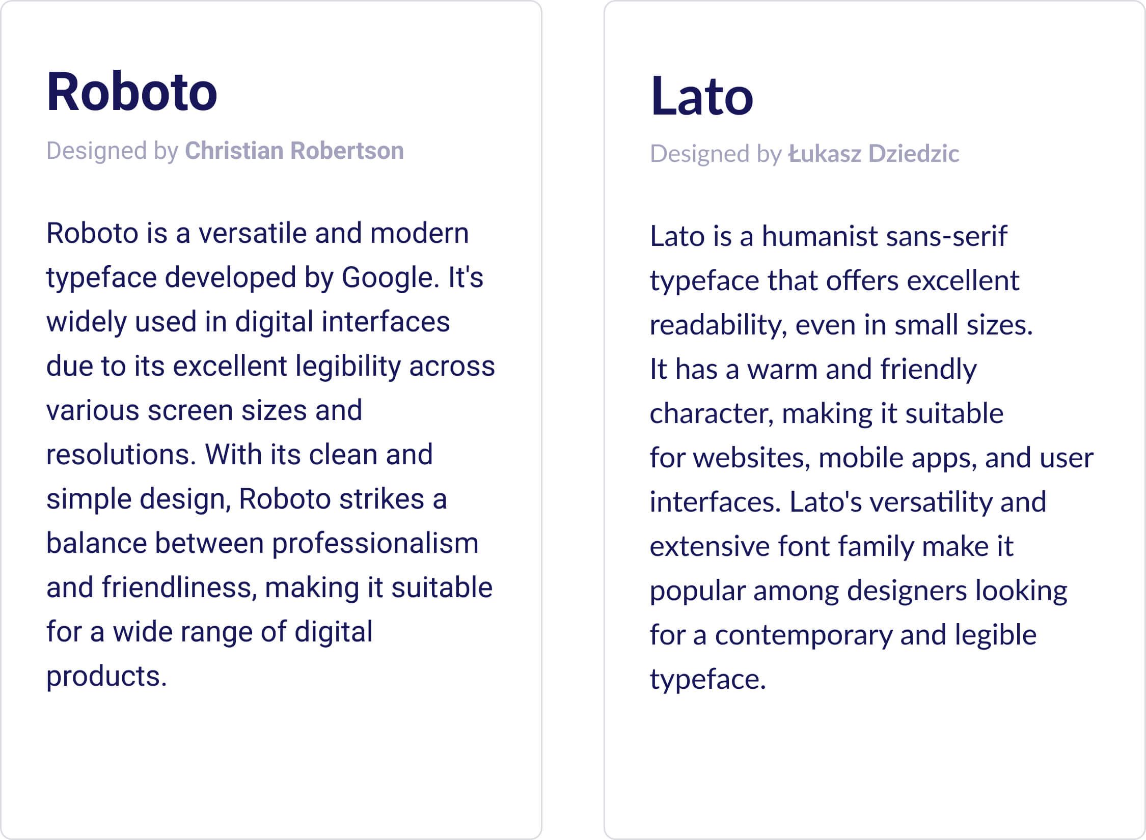
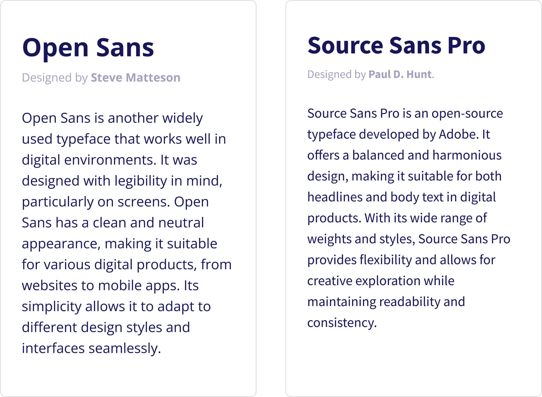
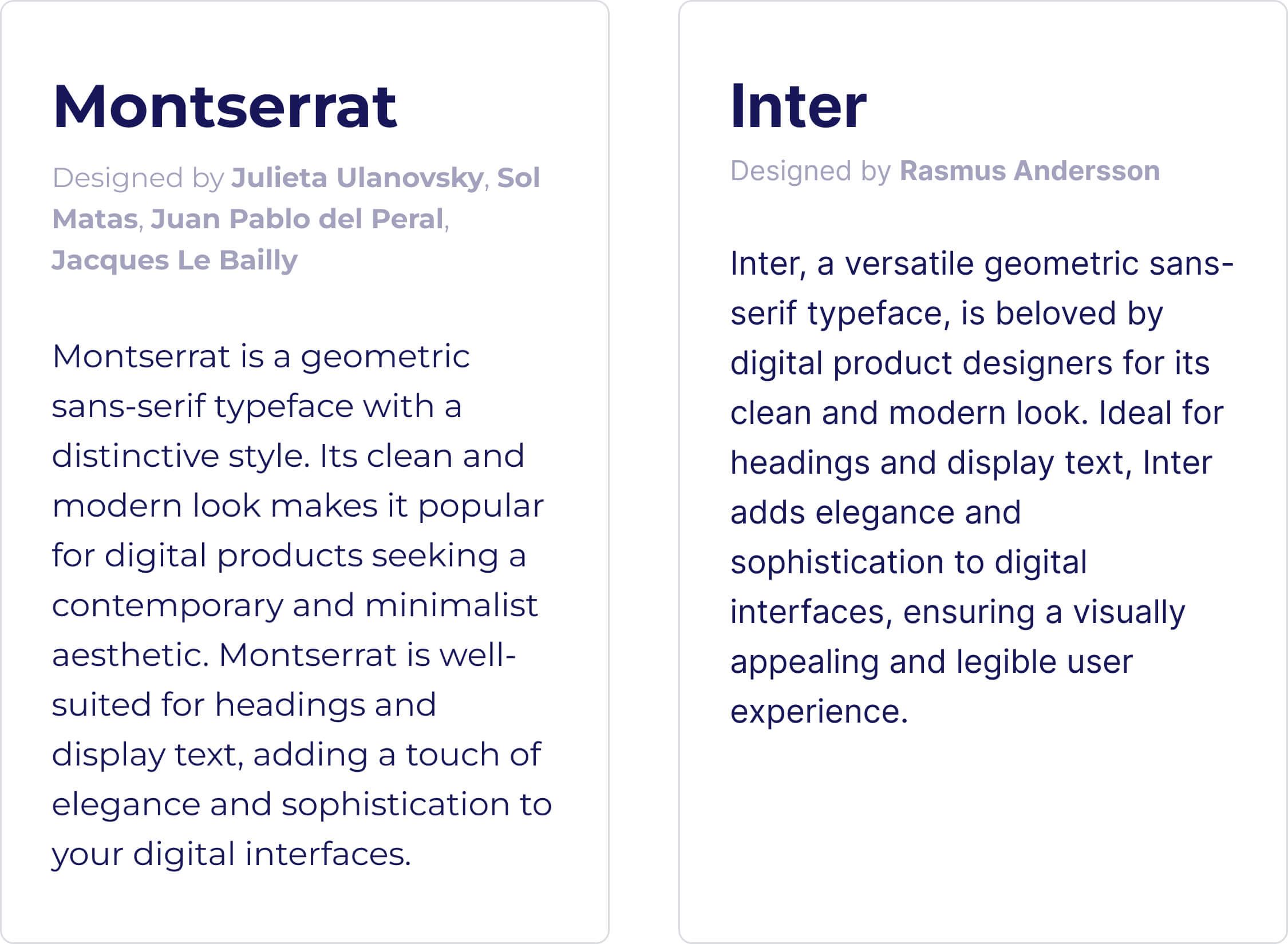
Selecting the right typeface depends on the specific context and brand personality of your digital product. The suggestions above are versatile and widely appreciated, but we’ll always take the time to consider unique requirements and align the typeface with your brand’s identity.
Enhancing Communication in the Digital Era
In this age, everything in our lives depends on digital products, and information overload is the norm. That’s why ensuring legibility and readability is crucial for effective communication. The proper selection of font size, spacing, and contrast contributes to the seamless absorption of your message, enhancing the user experience and preventing frustration. Investing in typography that effortlessly blends visual appeal with functional clarity lets you easily captivate your audience and deliver the message.
1. Typography Sets the Tone
Typography has the remarkable ability to set the tone and personality of your brand, transcending mere font selection. Each typeface possesses unique characteristics, ranging from commanding authority to exuding elegance. By meticulously choosing the right typography, you can effectively communicate your brand’s values, mission, and personality, instantly capturing the attention and interest of your target audience.
2. Consistency and Recognition
Consistency is the cornerstone of brand recognition. When your typography remains cohesive across all platforms—be it your website, social media, or marketing collateral—it creates a unified and indelible brand experience. Employing a consistent typography system ensures that your brand becomes easily recognizable, reinforcing a sense of trust and professionalism that resonates with your audience.
3. Typography Evokes Emotions
Typography, as an art form, has the power to evoke emotions and shape the perception of your brand. You can cultivate a sense of friendliness through playful and rounded typefaces, while bold and sharp fonts establish authority. By understanding your audience and aligning your typography choices accordingly, you can forge an emotional connection that strengthens brand loyalty and fuels lasting relationships.
4. Legibility and Readability
Ensuring legibility and readability is imperative for effective communication. The right font size, spacing, and contrast contribute to the effortless absorption of the brand message, enhancing the user experience and preventing frustration. Invest in typography that seamlessly blends visual appeal with functional clarity to captivate your audience.
5. Differentiation and Competitive Edge
Good UX design also fosters brand loyalty among users. When users consistently have positive experiences with a brand’s digital product or service, it cultivates loyalty and encourages repeat usage. Satisfied users are more likely to become brand advocates, sharing their positive experiences with others and contributing to word-of-mouth marketing. Brand love is fostered when users not only enjoy the product but also become enthusiastic promoters of the brand.
6. Differentiation in a Competitive Landscape
In a saturated market, differentiation is the key to carving a niche. Typography serves as a potent tool for standing out from the crowd and gaining a competitive edge. By daring to experiment with unconventional typefaces or employing imaginative font combinations, you can craft a visual identity that mesmerizes and intrigues your audience. Strive for a typography system that reflects your uniqueness, positioning you as a distinct player in the ever-evolving market landscape.
* * *
To sum up, typography is not a mere embellishment; it is a pivotal element in shaping your brand identity. By carefully considering the tone, consistency, emotional impact, legibility, and differentiation of your typography choices, you can create a brand that resonates deeply with your target audience and leaves an indelible mark. Investing in thoughtful typography will not only enhance your brand’s visual allure but also contribute to its overall success in the fiercely competitive business realm. So, embrace the power of typography and observe as your brand identity flourishes in the hearts and minds of your customers.