qsense
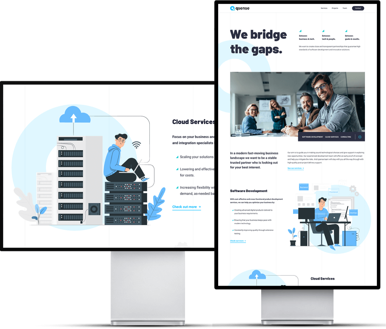
… is an IT company that offers cloud services and web app development to their clients. We had the task of creating a new website for their business, starting from defining the basis of their brand and creating the new visual identity.
Project type
Branding, Website
Our role
Branding, UX Research, Web Design
Year
2021
Link to the website


The task
The original qsense website and visual identity failed to follow the growth of the company. The website is too simple and offers little information about the company’s services, team, and portfolio. Visual identity doesn’t connect and communicate well with the target audience.
The solution
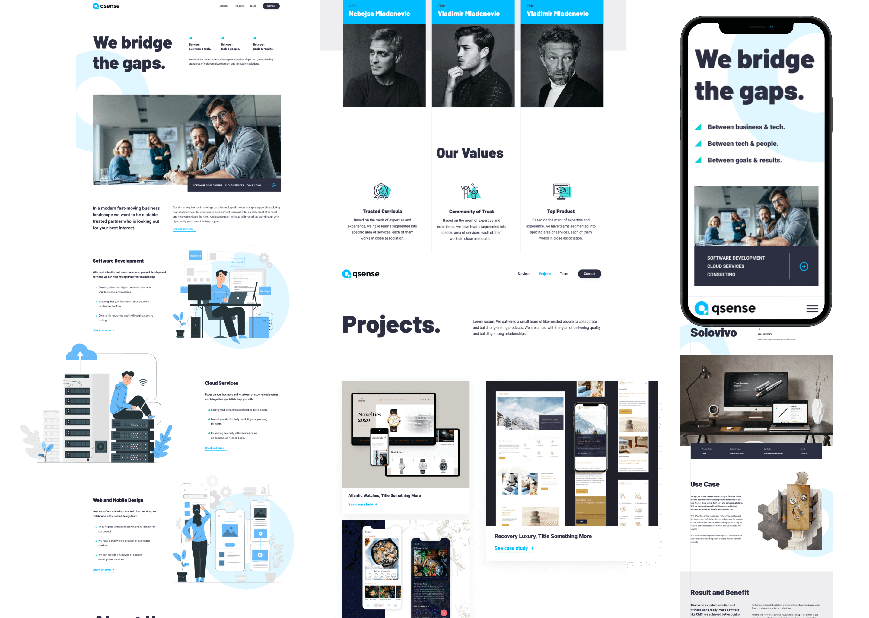
A brand starter workshop that helps the qsense team uncover and define how they want the mission and value brand to be perceived and best represented to the target audience. Based on this, we’ve created a new logo and visual identity for the website. We’ve also written the marketing and UX copy and finally designed a completely new site aligned with qsense mission and values.

The task
The original qsense website and visual identity failed to follow the growth of the company. The website is too simple and offers little information about the company’s services, team, and portfolio. Visual identity doesn’t connect and communicate well with the target audience.

The solution
A brand starter workshop that helps the qsense team uncover and define how they want the mission and value brand to be perceived and best represented to the target audience. Based on this, we’ve created a new logo and visual identity for the website. We’ve also written the marketing and UX copy and finally designed a completely new site aligned with qsense mission and values.
Branding
Thanks to a brand starter workshop, we worked with the qsense team to create a base for the brand identity that is recognizable and will evolve as their company grows.
Logo design
The q in qsense stands for quality – to them, it’s the only way to do their work that makes sense. The mark shows the letter Q subtly shaped like the pin symbol. The center represents the user icon putting the users and clients in the center of the qsense business and pinpointing them to the right place – one that offers modern technological solutions for their business.

Style Guide
Colors
Blue tones were the first choice for the color palette as it’s symbolism best correlates with the company’s values. It evokes feelings of trust, strength, and dependability. We’ve added some complementary shades of green accents to break the mold of the overly corporate but still keep the palette simple.
Typography
Website design
Blue tones were the first choice for the color palette as it’s symbolism best correlates with the company’s values. It evokes feelings of trust, strength, and dependability. We’ve added some complementary shades of green accents to break the mold of the overly corporate but still keep the palette simple.
Thanks to the workshop’s output, we’ve designed the visual identity and website that reflects and communicates the mission and values of the qsense team. And it will be able to grow and evolve with the company over time.

