EduBlend
EduBlend platform is created for companies that want to offer additional education to their employees.
Project type
Blended learning platform
Our role
UX design, UI design, Branding
Year
2019
Link to the project
edublend.rs
1500+
Registred users
600+
Added courses
900
Certificates Issued
The task
Creating an online learning platform for users who are not necessarily familiar with the concept of online education and are not advanced internet users.
The solution
The platform based on an innovative blended learning system. Unlike other websites for online education, Blender offers a combination of online and face-to-face lessons.
UX Design
UX Research
Studying the competition to figure out the similarities and differences, and find room for improvement, we realized we have a focus on a different type of audience.
Primary TA are employees in public companies who are not too tech-savvy. The company pays for their education, and they are obligated to attend the courses.
Needs
They wish to be in step with time and adapted to modern technology, but they can invest a minimum of time and effort, hoping for the best results. They also hope to make more money.
Pain points
- Works with outdated technologies & has trouble moving up in the career
- Has a family, so the time is limited and the schedules are tight
-
Earnings are pretty low
Secondary TA consists of young people, usually students who want to get a certificate. They feel that getting a certificate will improve their future career.
Needs
They believe that the more technologies they learn, the better the job they can get. This system works well for them because they just follow the given schedules of lectures, tests, and F2F meetings.
Pain points
- They don’t want to lose so much time, because they have to finish faculty
- They don’t want to make a lot of effort to organize extra studying
-
Online education is more affordable for students
High fidelity wireframing
Mobile screens were our starting point, because it helped us figure out the most important functions. By creating the MVP, we set the priorities but also got the functional product. We created over 60 wireframes to cover all the cases.

Style guide
Color Palette
Since this is an educational platform our priority was to provide sufficient color contrast to make instructions clearly visible. Our other goals were to promote a positive experience and avoid causing eye fatigue.
Colors
Typography
UI Design
Classic & Simple Design
We created a UI design that will efficiently and naturally communicate with the target audience. The users are able to visually divide content which contributes to a better perception of information.

Product Features
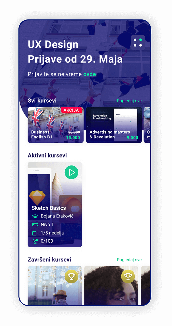
We kept the users interested with short and useful content, and we added effective text and illustrations.
-
All courses – here users can browse more courses and find ones they would attend.
-
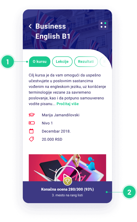
Activated course – Information about the course: lecturer, course level, time left to completion and scores.
-
See all courses – Links to the overview of all available courses meant to encourage people to go through the platform.
Other Features
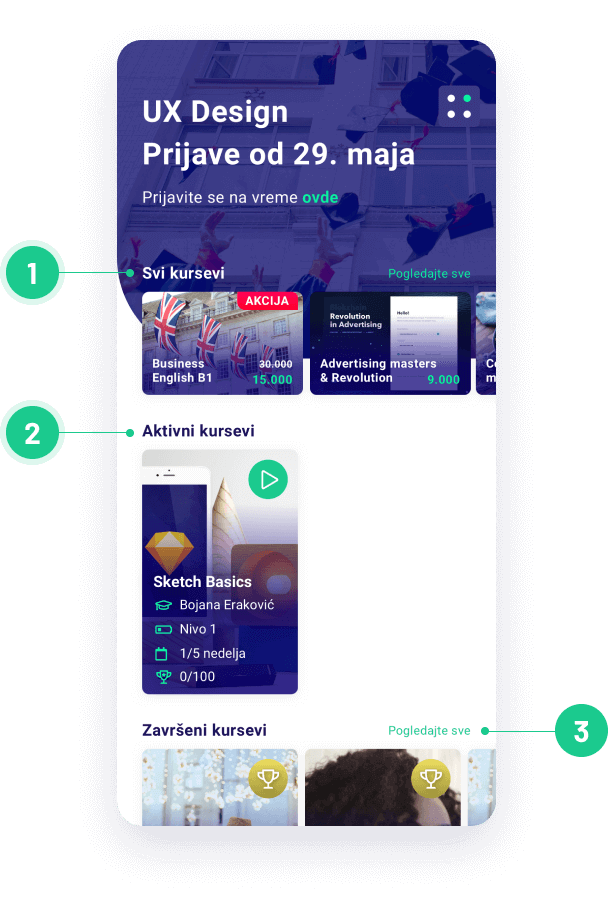
The user testing showed that users navigated around the website easily and could identify on which page they are.
-
Tabs – An overview of important information. It can be turned off or opened to show more details or swiped to the next information page.
-
Footer displays the student’s grade. It shows the number of points and maximum number, percentage of the grade, and leader board rand.
Desktop Design
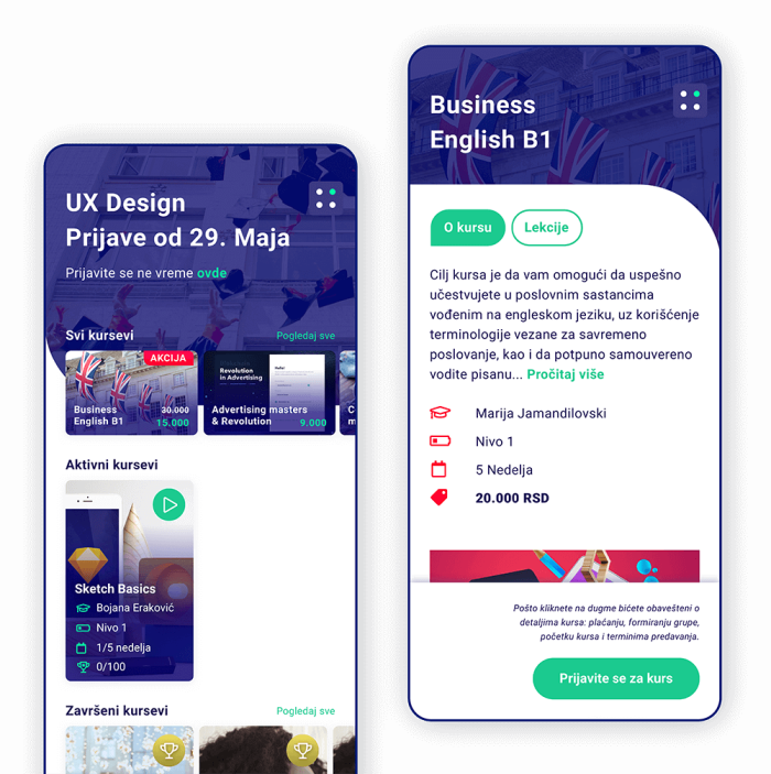
We created a responsive desktop design and simple interface. Keeping our target audience in mind. To achieve consistency, we used common UI elements. Creating patterns in language, layout and design throughout the site helped facilitate efficiency.
