Rebranding a website for IT and cloud services company
February 22, 2021
Written by Marija Jamandilovski
So, what happens when a company grows from 2 to 20 people fast and successfully develops the business? The business is able to serve more and more clients gaining more expertise or developing a successful product. But they eventually realize they put most of their energy into their clients’ businesses and their own gets left behind.
In cases like this, the abstract idea of the brand exists somewhere in the back of the founder’s mind, but stays undefined, existing without their control or the awareness of how crucial strategic use of it can be for the business.
Last summer, our partners at qsense decided their website and visual identity was long overdue for a refresher. And we realised that their business has matured to the point where they need to take control over the brand and finally start shaping its strategy.
Their website was created a long time ago in a hurry and because they needed one. It worked for a while. It’s what they wanted at the time, but unfortunately it failed to grow with them. It got to the point where they felt that the qsense logo, visual identity, and website do not follow what their business has grown to become.
They trusted us with the whole process of rebranding and building up a new website from scratch and we challenged them to start thinking about their brand more seriously. Here’s how it all went down…

Step 1: Website and brand identity audit
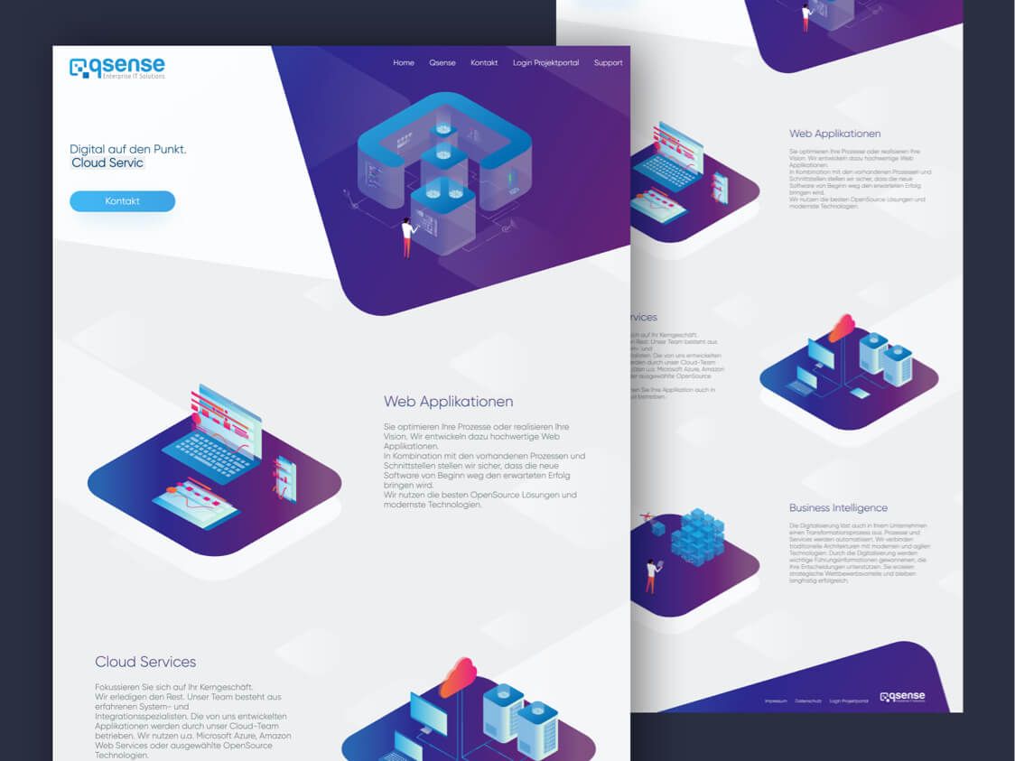
As for the original qsense website, the team told us it did the job it needed to do at the time. They’d made it on their own – the design, copy, and of course, coding. It simply and shortly stated the services on the home page and showed several team members and their roles.
At one point, they realized that neither their website nor visual identity represented the qsense team. It became pretty outdated. It was hardly informative. There wasn’t enough relevant information about their services, team, or portfolio of work. It did not give a chance to their target audience to connect with their business.
They repeated how they’re aware it required more time and effort. And they kept trying to find time to continue working on it, and later on to make a new website. But years passed, and naturally, growing the company and clients’ projects were always more important than anything.
Step 2: Brand starter workshop
We find workshops a fantastic opportunity to get to know our clients and their needs and save precious time. They help us set clear goals, timelines, and budgets for projects. Beginning this project, we knew that we needed something different than our usual product workshops.

It was evident that the qsense team required more work on uncovering and defining their brand. They are an IT company operating in a very competitive landscape. What we needed to find out together was how they were different from everyone else. Now, don’t get us wrong, we don’t think that we can create a full-on brand in 4 hours, but this was an important conversation to start. We needed to at least set a firm foundation.
So we created a quick custom workshop to help them get a bit deeper into where the company stood at the moment, where the team saw it in the future, and what sets them apart from the competition. Our first important goal was to define a brand that reflects the values and mission of the qsense team.
The workshop aimed to transform the idea of the qsense brand into something tangible. We helped them get a clearer picture of what they wanted by talking about their motivation, future, and position in the industry landscape. They came in prepared with open minds and a sound idea of where they see their business in the future. They got out with solutions and a more exact idea of what the qsense brand needed to become.
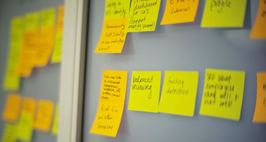
The first part of this workshop dealt with the team’s vision of future, defining where they want qsense in 5, 10, and 20 years. Then we moved on to their motivation, or their Why for the work they do. We got to the powerful answer that they wanted to make every job in the world simpler with their services and products.
We ended this part with another challenging task. Choosing 3 values they want their brand to represent. They agreed on Trusted partnerships, Sustainability, and Clarity.
Once we covered these more abstract questions, we turned outwards to find out where the brand stood in relation to the industry and competitors, and we also needed to talk more about their target audience. At this point, we defined who their most valued clients and the potential partners could be.
We then analyzed some of their competitors and how they represented themselves and communicated with the target audience. It helped them position their own brand relative to the competitors and target audience.
At the end of the workshop, they had a coherent idea of who they were and what they wanted. And our team had a clearer picture of what we needed to create for them. We created a brand deck, a pdf document with all the information and conclusions that gave everyone a common language to describe what the qsense brand represented. With this deck, we had a valuable tool to guide us all in decisions on strategy, visual identity, or communication.

Furthermore, it stays a useful tool for the qsense team in the future whenever they need to guide partnering teams (marketing, design, etc.) through their brand or explain to the employees what their company is all about. They can even go back to it themselves to remind them of the purpose of their work.
Step 3: Website copy as the base for the UX
Since the site is mostly presentational, we’ve decided to lean on content as the base for the UX. Our goal was to present the story of qsense through their values and make the brand alive and relatable. The UX/UI designer and writer worked together to establish the layout of the pages. Only after that did we move on to writing the text, which would further dictate the pages’ structure.
In both text and design, we focused on 2 things – conveying the key messages and telling a story. Simultaneously, we wanted to allow the reader to get the essential information quickly and without being overwhelmed. As much as we were eager to tell a coherent story, we ensured that all the necessary information could be found after a few seconds on the page. But after this, the reader could be pulled deeper into the text to get more details and a more in-depth story, which eventually establishes connection and trust.
As for the tone of voice, we used a semi-formal style that’s most comfortable for the audience in Switzerland, where the qsense base is. It is neutral enough to be well-accepted by the readers worldwide, but we’ve managed to make it warm enough to sound knowledgeable but friendly. We wanted to avoid sounding too dry or corporate, so we’ve created the voice of an innovative hands-on team of experts.

Our goal was to base the communication on the most important of the 3 values we established in the workshop, Trusted partnerships. Their focus is on creating strong relationships both with their clients and other businesses, which are also the most important audiences for their website. These were the audiences we were creating a conversation with. The text had to express what’s important to the team and effectively communicate why qsense services and the team were the best choice.
How did we describe this value throughout the website pages? The qsense website states a wish to create meaningful connections from the very beginning. These connections are made through building trust. Their goal is to gain the clients’ trust by offering a full set of exceptional services, but also by choosing the best technologies as tools, and creating an expert team. And finally, by presenting a portfolio that shows previous work and partnerships that are already built.
Step 3.1: Logo and branding
-

Creating the logo
The one thing the qsense team was adamant about was that the logo needed to be in the shape of a letter Q. And why? It was another expression of their values. The Q in their name stands for quality. To them, it’s the only way to work and create that makes sense. It’s the quality they make sure to provide to their clients (because we would add, only half-jokingly, of their 6th sense for it). With this information and the Brand Starter Workshop’s output, the design team worked on redesigning the qsense logo.
Building Trusted partnerships is the value that led us in creating the visual identity too. We designed several options to decide on the right direction. We explored the possibilities of merging the Q shape with a cog (suggesting that qsense works like a well-oiled machine), an arrow (symbolizing the right direction), and a ray of light (symbolizing a path to a goal). We finally settled on a pin-shaped Q with a user icon shape in the middle.
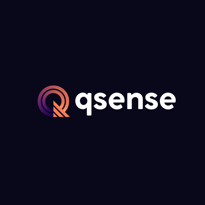
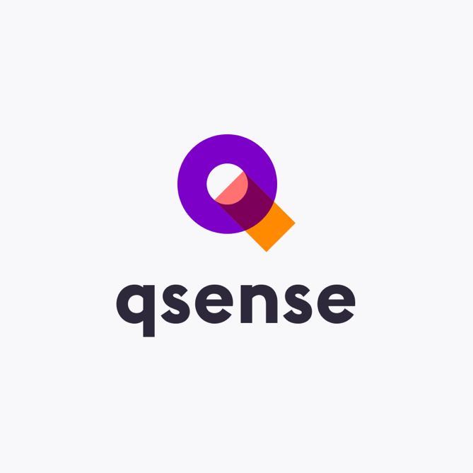
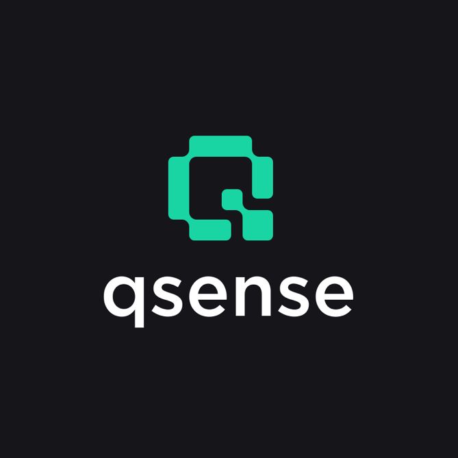

The idea is that the pin shows people that with qsense, they found the right place for their business. And in the center of everything qsense does are people, their customers, users, partners, team, and any person in the world their work affects.
And there’s another small thing we added as a bonus. The triangular shape at the lower right corner of the logo gives the whole image a look of the sticker being removed, indicating there is much more below the surface.
-

Colors & Typography
As for the color palette, blue tones were the first choice as their symbolism best correlates with the company’s values. Blue evokes feelings of trust, strength, and dependability. We’ve added some complementary shades of green for accents to break the overly corporate mold. We kept the palette simple with the white background. The aim was to achieve a light and airy feel.
As this site required a lot of text, we used typography to create a clear structure. We decided that the simplicity of Barlow is the best choice for headlines but needed to pair it with another sans serif font for the body of text to add visual interest. Roboto, a sans serif geometric font with open curves, was a perfect addition for the clean and minimalistic look we wanted to achieve.
Step 4: Website design
Finally, working on the website’s UI, we aimed for a clean and minimal look but wanted to avoid it looking clinical. The idea was to create something creative but still mature and not overly corporate. The most important thing was to structure the information well and avoid having large blocks of the text that’d be hard to read.
Before
After
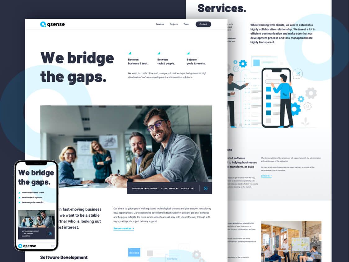
These are the pages we decided to make:
Home – shows visitors why qsense is the right team for them. Gives an introduction to the company’s mission, explains what the company does and how it works.
Team – shows the expertise of the people and technologies the team uses to give visitors confidence their project is in good hands.
Services – gives a more in-depth explanation of the services and their benefits for the clients.
Portfolio – gives an overview of previous projects, so the visitor has an insight into the team’s experience and expertise.
Every element we’ve created serves an overarching purpose of the website – to present a team of experts who offer high-quality cloud services and web apps, and build trusting long-term partnerships with their clients. Our job was to help visitors (and search engine bots) understand this from the moment they enter the site.
• • •
Finally, after months of work the qsense website with a fresh new story and look is ready for the world. It was an amazing experience to work with their team and to make a firm foundation for building their brand. We are happy that we got to help them create their story both through design and words. Creating a brand and setting its strategy is a journey and they made a solid first step on it.
If you have questions about this process or any difficulties with your own redesign or defining your brand, feel free to reach out. We are here to help! Moye Team